Color Harmony Studio
Explore how color temperature and combinations affect room mood and emotional well-being
Light Temperature Explorer
Adjust the slider to see how different color temperatures (measured in Kelvin) affect the mood and atmosphere of a space.
Move the slider to explore different color temperatures from warm candlelight (2000K) to cool daylight (6500K)
Real-Time Palette Generator
Generate harmonious color palettes inspired by natural lighting and emotional therapy principles.
Click the button above to generate a new harmonious color palette
Pre-Built Emotional Palettes
Explore color combinations designed to support specific emotional goals and moods.
Calm & Serenity
Soft blues and lavenders create a peaceful, tranquil atmosphere. Ideal for bedrooms, meditation spaces, and areas where you need to unwind.
Best for: Rest, relaxation, stress reduction, sleep preparation
Energy & Focus
Bright yellows and clean whites promote alertness and mental clarity. Perfect for home offices, study areas, and creative workspaces.
Best for: Productivity, concentration, creative work, morning routines
Warmth & Comfort
Warm apricots and soft peaches create an inviting, cozy environment. Excellent for living rooms, dining areas, and social spaces.
Best for: Socializing, comfort, emotional warmth, evening relaxation
Balance & Harmony
A balanced combination of all emotional colors creates harmony and versatility. Works well in multi-purpose spaces and transitional areas.
Best for: Versatile spaces, emotional balance, year-round adaptability
Mood Room Generator
Visualize how different color palettes transform a room's emotional atmosphere. Click a mood button to see the transformation.
Select a mood above to see how colors transform this space
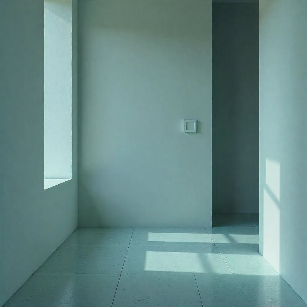
How Color Temperature Affects Room Mood
Understanding the psychological impact of color temperature helps you create spaces that support your emotional needs throughout the day.
Warm Colors (2000K - 3000K)
Warm color temperatures, similar to candlelight and sunset, create feelings of:
- Comfort and coziness
- Relaxation and calm
- Intimacy and warmth
- Appetite stimulation
Ideal for: Bedrooms, dining rooms, living areas, evening spaces
Cool Colors (4000K - 6500K)
Cool color temperatures, similar to daylight and overcast skies, promote:
- Alertness and focus
- Productivity and efficiency
- Mental clarity
- Visual acuity
Ideal for: Offices, kitchens, bathrooms, task areas, morning spaces
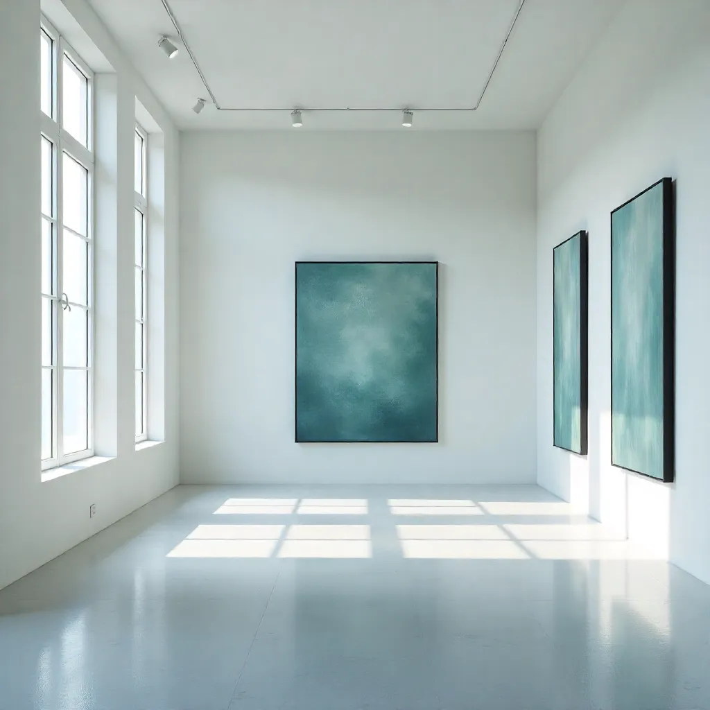
Color Psychology in Practice
Different colors evoke specific emotional responses. Here's how to use color psychology to enhance your living environment:
Morning Apricot
Gentle warmth that promotes optimism and emotional balance. Use in spaces where you start your day to set a positive tone.
Pale Sky Mist
Soft coolness that enhances clarity and calm. Ideal for areas requiring mental focus and emotional stability.
Daylight Gold
Optimistic and energizing, this color stimulates creativity and positive thinking. Perfect for creative workspaces.
Lavender Haze
Calming and balancing, this tone reduces stress and promotes tranquility. Excellent for relaxation areas.
Pure White Dew
Fresh and bright neutrality that provides a clean foundation. Use as a base to let other colors shine.
Combined Harmony
Blending multiple emotional colors creates balanced, versatile spaces that adapt to different needs throughout the day.
Ready to Apply Color Psychology?
Use these tools and insights to create spaces that truly support your emotional well-being. Start with one room and notice the difference color makes.
Learn Light Mapping Get Personalized Advice